October 31, 2025
Texture Could Be the Key Element Your Design is Missing
Occasionally, you encounter a design that just… feels different. A website loads and somehow appears more immersive than others. You pick up a printed brochure and your eyes keep dance over the imagery. A presentation feels warm and layered. Even without consciously identifying the reason, you sense that care and intention have gone into the experience.
Often, the difference lies in a subtle design element that tends to be both underutilized and underappreciated: texture.
Even among skilled digital designers, texture is frequently overlooked in modern design discussions, which tend to focus on colour palettes, typography, and layout. Yet texture shapes how people experience a visual environment, regardless of whether the design exists in the real world or the digital realm. This is because texture adds depth, character, and atmosphere, transforming a design from something purely functional into something memorable.
For businesses seeking to present themselves with greater sophistication and clarity, the thoughtful use of texture can be one of the most effective ways to elevate a brand experience.
What Designers Mean by “Texture”
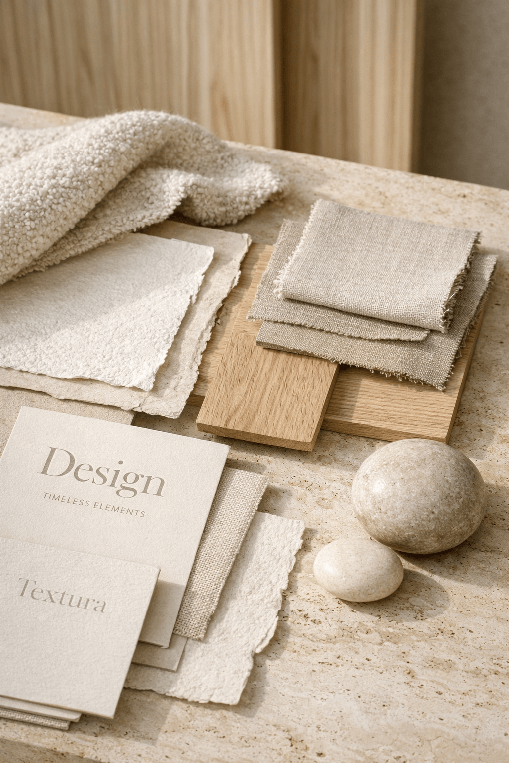
In traditional art and architecture, texture refers to the physical surface of a material. Think of different types of stone, wood grain, fabric, or metal.
In digital and brand design, texture functions a little differently. Because screens are smooth, texture must be implied visually rather than physically experienced.
This visual texture may appear through photographs or digital recreations of:
- Subtle paper or fabric patterns
- Materials such as marble or wood
- Mediums like sand, foliage, or water
- Layered gradients and lighting effects
- Soft grain or film-style overlays
When used thoughtfully, these elements add depth and atmosphere without overwhelming the design itself. Textures that align cohesively with the overall brand identity help create an environment that feels more real, more natural; more human.
Why Texture Matters in Modern Design
Minimalist design has dominated digital aesthetics for many years. Clean layouts, space, and simple typography remain valuable tools for clarity. However minimalism can start to feel too stark when designs appear sterile or interchangeable. Texture can help to restore a sense of warmth and individuality.
It can:
- Add visual depth to otherwise flat layouts
- Reinforce brand personality
- Guide attention through subtle contrast
- Create emotional resonance
- Make a digital experience feel more tactile and human
In essence, texture creates physical dimension within a digital design. Just as a well-designed building, store, or restaurant incorporates multiple materials and surfaces, a thoughtfully designed website or brand environment benefits from subtle layers that make the experience feel richer.
Texture in the Physical World: Lessons from Architecture
To understand the power of texture, it helps to look beyond digital design. Let’s step away from digital design to consider the impact of texture in a hypothetical architecture project.
Imagine a hospital built entirely of white drywall with fluorescent, overhead lighting. We all know the type. You would probably describe this type of a physical environment as clinical and impersonal. Now imagine that some interior designers were hired on to the project and that their contractors installed some contemporary wood paneling, natural stone accents, neutral textured fabrics to create comfortable seating areas, and some beautiful landscape paintings to bring cohesive natural colours to the walls. You would likely now describe the same space as calm and welcoming.
Many modern healthcare facilities now intentionally incorporate natural materials for precisely this reason. Research suggests that environments featuring natural textures like wood, plants, and organic materials can reduce stress and promote a sense of comfort.
Not surprisingly, these design principles translate surprisingly well into digital environments. When visual surfaces feel layered and intentional, visitors often experience a website as more thoughtful and refined.
How Texture Supports Brand Storytelling
Texture also plays a subtle, yet potent role in communicating brand identity, as different materials evoke different associations. For example:
- Marble may suggest timelessness and luxury
- Linen or handmade paper can evoke craftsmanship and authenticity
- Metal textures may communicate precision and industrial strength
- Natural landscapes suggest sustainability and environmental awareness
Businesses can use these associations to subtly reinforce their positioning. A winery might incorporate vineyard textures such as weathered wood, cork, or stone to evoke a sense of tradition and place. A luxury hotel might draw inspiration from textiles and architectural materials that reflect the character of its surroundings. A school might include student artwork or materials and patterns that align with the school’s culture to help students and their guardians see themselves in the visual representation of the school’s brand.
In each case, texture becomes part of the brand narrative, which reinforces a feeling of belonging among its current and prospective community members.
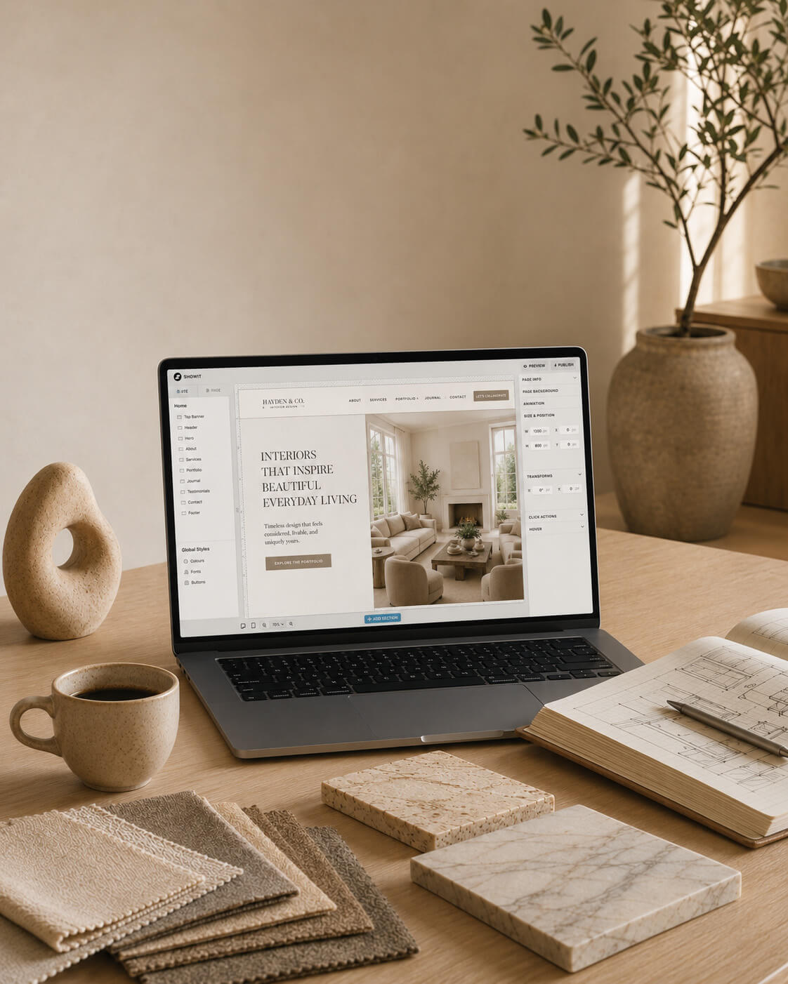
Texture in Digital Design: Subtlety Is Key
In digital design, texture often plays a more subtle role than it does in physical environments. Unlike printed materials or architectural surfaces, websites and digital platforms exist on illuminated screens, where heavy textures can easily become distracting or visually overwhelming. For this reason, the most effective digital textures are often subtle; sometimes so subtle that viewers notice their effect long before they consciously notice the texture itself.
Thoughtful texture in digital environments helps prevent designs from feeling flat or overly mechanical. Modern websites frequently rely on large fields of colour, clean typography, and generous spacing. While a certain degree of simplicity is essential, if overused it can result in visual environments that feel somewhat sterile or impersonal. When this occurs, designers can restore a sense of warmth, depth, and visual richness by carefully introducing texture.
In digital design, texture might appear through the gentle use of digital graining in background media, colour gradients that mimic light across a surface, or faint organic patterns inspired by natural materials such as linen, stone, or brushed metal. These textures rarely dominate the design. Instead, they function as atmospheric layers that add character without competing with the primary content.
For example, a winery’s website might incorporate subtle textures inspired by the vineyard itself, like weathered wood, or handmade paper to evoke craftsmanship and connection to the land. A financial advisory firm, by contrast, might employ extremely refined textures, such as a faint architectural grain or a brushed metallic tone to communicate stability and professionalism.
The key principle is restraint. Texture should support clarity rather than interfere with it. When applied thoughtfully, it helps digital spaces feel more dimensional and human, while still preserving the clean functionality that modern websites require.
In many ways, texture in digital design functions similarly to lighting in architecture. When used skillfully, it enriches the environment without drawing attention away from the purpose of the space itself. Visitors may not consciously identify the texture, but they often experience the result: a brand that feels more refined, considered, and memorable.
Texture and Visual Hierarchy
To understand the role of texture in design, it is helpful to first define visual hierarchy.
Visual hierarchy refers to the way design elements are arranged so that viewers intuitively understand where to direct their attention and which information is most important. Through the careful use of size, contrast, spacing, colour, and positioning, designers guide the viewer’s eye across a page or visual environment in a logical and intuitive sequence.
A well-designed visual hierarchy allows people to quickly absorb information without feeling overwhelmed. Headlines stand out clearly. Supporting text becomes easy to read. Important messages are communicated prominently, while supporting information is available for those who need additional clarification.
Texture can help to differentiate layers of information. For example, a lightly textured background might distinguish a particular section of a website from surrounding areas, allowing visitors to recognize that they are moving into a new topic or category of content.
In brand identity systems, this technique can become especially powerful when applied consistently across multiple formats.
On a website, a particular texture might appear behind key sections that introduce services or highlight important messaging. In printed materials such as annual reports, brochures, or conference displays, the same texture might be used as a background element for section dividers, cover pages, or presentation panels.
Over time, these repeated details begin to reinforce brand recognition. Audiences may not consciously notice the texture itself, yet it contributes to a visual environment that feels cohesive and familiar. For instance, a renewable energy company might use a subtle organic texture inspired by natural landscapes across its website, annual reports, and trade show displays. The texture becomes part of the visual language that supports the brand’s broader narrative.
When used thoughtfully, texture strengthens visual hierarchy and reinforces the brand’s identity across multiple touchpoints.
Balancing Texture with Simplicity
Texture can enrich a design, but like any visual element, it must be balanced carefully. One of the guiding principles of strong design is simplicity, which is the idea that every element within a composition should serve a clear purpose. When too many textures compete within the same space, the result can feel chaotic or visually heavy.
Because of this, the most successful designs often rely on a handful of carefully chosen textures that appear consistently throughout the brand system. Restraint allows texture to complement other elements rather than competing with them. Typography remains legible. Imagery retains its visual clarity. Layouts feel open and breathable.
Consider the difference between a conference display filled with multiple patterns, gradients, and textures versus one that uses two or three harmonious textures behind key panels. The latter typically feels more polished and professional because the visual environment remains focused.
The same principle applies to websites. Subtle background textures may appear behind specific sections, while other areas remain clean and minimal. This contrast creates rhythm and visual interest without overwhelming the viewer.
Another important consideration is scale. Texture should often be large enough to feel intentional but soft enough that it does not interfere with readability. Designers frequently reduce opacity or adjust contrast so that the texture sits comfortably beneath the content. Ultimately, balancing texture with simplicity is less about adding visual complexity and more about enhancing atmosphere.
When used sparingly and consistently, texture contributes depth, character, and visual harmony. When overused, it can obscure the clarity that good design depends upon. However texture, or any media, is used, the goal must always be to support the message, not distract from it.
How to Know When Texture Is Missing
Designers sometimes recognize when texture is needed by observing how a composition feels instead of analyzing its structure. A design may be technically sound, the layout may follow good typographic principles, or the colour palette may be carefully chosen. Yet sometimes the overall experience can still feel somewhat flat or unfinished. This is often the moment when texture becomes relevant.
Flat designs can sometimes appear overly digital, almost as though they exist entirely on the surface of the screen without any sense of depth or materiality. Introducing texture can restore that missing dimension.
For example, a website with large colour blocks and crisp typography might benefit from a subtle grain or natural pattern that softens the digital edges of the composition. A printed annual report might feel more tactile and refined if section dividers incorporate a textured background inspired by paper, fabric, or natural materials.
Another indicator that texture may be missing is when different pieces of communication feel visually disconnected. A website may look modern and minimal, while printed materials feel more decorative or expressive. Introducing a shared texture across both environments can help unify them into a cohesive brand system.
In many cases, texture can work quietly in the background to make a design feel more grounded and dimensional, while enhancing the larger visual language. When introduced thoughtfully, it can transform a design that feels purely functional into one that feels crafted and intentional.
The Quiet Power of Thoughtful Details
One of the defining characteristics of sophisticated design is attention to detail. Many of the elements that elevate a design from competent to memorable are surprisingly subtle. The spacing between lines of text. The balance between images and white space. The consistency of colours across different materials.
Texture belongs to this category of thoughtful details. Unlike bold graphics or large images, texture rarely demands attention. Instead, it enriches the environment in quiet ways that viewers may only perceive subconsciously.
In physical environments, we instinctively recognize the role of texture. The grain of wood furniture, the softness of woven fabric, or the patina of aged stone all contribute to how a space feels. Design works in much the same way.
When texture is integrated into brand identity across websites, printed materials, event displays, and presentations, it introduces a layer of visual sophistication. The brand begins to feel more tactile and dimensional, even in digital environments.
Across related materials, the overall impact of texture can accumulate gradually. A subtle background pattern appears on a website. The same texture becomes part of a brochure design. Later, it appears on conference displays or presentation materials. Over time, audiences begin to associate this visual element with the brand itself.
This is the power of thoughtful design: Individual details that may seem small at first come together to create an environment that feels cohesive, intentional, and memorable. When used carefully, texture becomes one of those details; a gentle but powerful tool that brings depth and character to a brand’s visual language.
Presenting Our Recent Work :
Return to the Archive Blog X


BORN & RAISED IN Calgary, Alberta AND IS
our ceo & lead designer WAS
proudly
Canadian
proudly Canadian.
Lauren Killam draws creative inspiration from both her academic background and global experiences. With a foundation in applied mathematics and anthropology, she brings a thoughtful blend of analytical precision and cultural curiosity to every project. Having lived in the Middle East and California before returning to Calgary, Lauren infuses her work with a rich mix of perspectives that are grounded in strategy, guided by empathy, and always ready to challenge the status quo.
Based in Calgary, Alberta and Proudly Canadian • Web Design • Graphic Design • Marketing Strategy • Visual Branding • Copy Writing • Product Development • Email Design • Social Media Design • SEO • Image Curation • Website Auditing • Based in Calgary, Alberta and Proudly Canadian • Web Design • Graphic Design • Marketing Strategy • Visual Branding • Copy Writing • Product Development • Email Design • Social Media Design • SEO • Image Curation • Website Auditing • Based in Calgary, Alberta and Proudly Canadian • Web Design • Graphic Design • Marketing Strategy • Visual Branding • Copy Writing • Product Development • Email Design • Social Media Design • SEO • Image Curation • Website Auditing • Based in Calgary, Alberta and Proudly Canadian • Web Design • Graphic Design • Marketing Strategy • Visual Branding • Copy Writing • Product Development • Email Design • Social Media Design • SEO • Image Curation • Website Auditing • Based in Calgary, Alberta and Proudly Canadian • Web Design • Graphic Design • Marketing Strategy • Visual Branding • Copy Writing • Product Development • Email Design • Social Media Design • SEO • Image Curation • Website Auditing •
Based in Calgary, Alberta and Proudly Canadian • Web Design • Graphic Design • Marketing Strategy • Visual Branding • Copy Writing • Product Development • Email Design • Social Media Design • SEO • Image Curation • Website Auditing • Based in Calgary, Alberta and Proudly Canadian • Web Design • Graphic Design • Marketing Strategy • Visual Branding • Copy Writing • Product Development • Email Design • Social Media Design • SEO • Image Curation • Website Auditing • Based in Calgary, Alberta and Proudly Canadian • Web Design • Graphic Design • Marketing Strategy • Visual Branding • Copy Writing • Product Development • Email Design • Social Media Design • SEO • Image Curation • Website Auditing •
 (1)")
")
Explore Our services
BrAND
IDENTITY
Refined branding that captures the heart of your business with clarity and elegance, leaving a lasting impression with every detail.
pause
")
Explore Our services
Graphic Design
Purposeful design that seamlessly blends style and function, crafting interactive experiences your audience will come to trust and depend on.
pause

Explore Our services
copy- writing
Carefully crafted copy that speaks with clarity and purpose, capturing your brand voice and compelling your audience to take action.
pause

Explore Our services
art direction
Curated art direction guides visual storytelling, upholding brand compliance and business objectives across multi-disciplinary teams.
pause

Explore Our services
Media curation
Thoughtfully curated media that aligns with your brand’s identity, bringing your message to life with authenticity and visual impact.
pause

Explore Our services
marketing strategy
Integrated, thoughtful strategy that bridges design and direction, shaping a clear path to attract and convert ideal clients with purpose and precision.
pause
")

Explore Our services
Search & AI
Optimization
Strategic search engine and AI optimization that amplifies your online presence, boosting visibility, driving traffic, and enhancing user experience.
pause
")
explore The Archive
explore
The Archive
Think of our blog as your insider pass to our private catalogue. You'll find expert insights and inspired guidance on everything from web design and copywriting to marketing strategy and creative inspiration. It’s all beautifully curated to help your business grow with style.
")
platform comparison

hot off the press
")
essential article
these are a few of
Our Things
Our
Things
favourite
QUICK DISCLOSURE
Many of the sections listed below contain affiliate links for products and services that our CEO has used and loved for years. This simply means that we may receive a commission if you purchase something from this page. It won't cost you more (in fact, a lot of these programs actually include special offers that save you money) and it really helps us out. Plus, ya know, we were going to share it with you anyway!
")
website builder
showit
the drag and drop
platform of dreams.
Showit is the RH of web design platforms. So, if you want a truly exquisite website without the six figure budget and months spent writing endless custom code, look no further.
SUBSCRIPTIONS START AT $22 USD/MONTH, BILLED YEARLY. You get A free month and so does Curator.

photography
sweet ginger
capture the Moments Your Heart will treasure.
It is our great pleasure to introduce you to Virginia. We are so deeply enamoured with her work, you can safely assume that any recent photograph of our CEO or family is a Sweet Ginger creation.
Investments vary by session type. you get a 15-minute mini session for $275 and WE get A $50 credit!
")
premium custom printing
Jukebox
the printer of dreams for Marketing Collateral
When you need materials to represent your brand in the analog world, trust Jukebox. Their proof system shows you exactly what your products will look like. #goodsurprisesonly
When you spend more than $50 on your order you get $25 off and we get a $25 credit.
 (1)")
Lead Magnets + More
BDOW!
the ultimate integrated conversion system
BDOW! gives you the best combination of features, flexibility, and pricing in the market. No coding required. Just everything you need to build high-converting experiences, connect your systems, and then launch, optimize, and grow.
send us an email to request discount info.
 (1)")
customer relationships
honeybook
Organize your business,
your way, all in one place.
HoneyBook is the software solution that has created the greatest freedom and ease in our business. We can focus on you because of its full suite of business management and client interaction tools.
SUBSCRIPTIONS START AT $16 USD/MONTH, BILLED YEARLY. You get 30% off your first year and we get up to $100.

Project management
Clickup
one (productivity) app
to replace them all.
What HoneyBook is to customer relationship management software, ClickUp is to project management software. We use ClickUp for lead magnet funnel strategies, and so much more.
Free plan available. I get $1.50 for free accounts and up to $20 per seat for paid accounts.
")
Digital workspace provider
Everything, everywhere, oraganized all at once.
Curator relies on Google Workspace to keep our business balanced with a productive and functional home life. Calendars, email, business and client files; this is how we manage our daily flow.
ask your project's lead designer for a unique promo code to get 10% off your first year.
")
information security
Keeper
Essential security for your everything.
We've been using Keeper to protect family passwords and streamline our home admin for YEARS. So, when I began my web design career, using Keeper for my business was the easiest choice ever.
Personal Plans begin at $2.92 USD/month. you get 30% Off and I get $30.
")
Financial management
quickbooks
the world's leader in business accounting
I can faithfully say that this is the most powerful accounting software I've used. While it's true that I appreciate QB's extensive features, its the numerous native integrations I treasure most.
subscriptions start at $24 CAD/month. You get 50% off your first 6 months and i get $100 CAD.
")
Business banking
Venn
stress-free and low-fee small business banking
We believe this is the most user-friendly and cost-effective business banking account available in Canada today. Sign up online, get instant cards, earn cashback, and don't get shocked by fees.
get an enrolment bonus of $100 when you spend more than $10,000 with your new venn card.
")
legal protection
WebsitePolicies
Website-Policies
simple cookie consent and privacy compliance
Cookie
& privacy compliance
The role of user activity data in a company's marketing activities is governed by complex legal frameworks. Compliance is essential, and websitepolicies makes it easy to stay on top of requirements.
The role of user activity data in a company's marketing activities is governed by complex legal frameworks. Compliance is essential, and Website-policies makes it easy to stay on track.
WebsitePolicies.com has the best pricing available. Choose the subscription that's right for you.
")
legal protection
contract shop
like your bff is a lawyer, but better.
like your bff is
a lawyer, but better.
It's no understatement to say that legal protection is an absolute necessity for every person or entity with an online presence. Website T&Cs, client contracts; you name it, you need it.
contract templates vary by type. You get peace of mind (priceless) and i get 20% on each sale.
The
BUSINESS


LOOKING for our INSTAGRAM?
Sorry, you're not going to find it.
Disappointed? Send us a quick note to strike up a conversation or request an in-person chat. We can't wait to meet you!
We respectfully acknowledge that our work takes place on the traditional and ancestral lands of the Treaty 7 region in Southern Alberta. This includes the Blackfoot Confederacy, comprising the Siksika, Piikani, and Kainai Nations, as well as the Tsuut’ina Nation and the Stoney Nakoda Nations of Chiniki, Bearspaw, and Goodstoney. We also recognize that Calgary is home to the Otipemisiwak Métis Government of the Métis Nation within Alberta, Region 3.
We honour the enduring relationships that Indigenous Peoples have with this land,
and we recognize that this territory has been a place of gathering, livelihood,
and cultural connection for over 10,000 years.
We acknowledge the deep and ongoing impacts of colonization, including displacement,
cultural erasure, systemic injustices, and intergenerational trauma that continue to affect
First Nations, Inuit, and Métis communities today. We recognize that
these harms are not only historical, but present and ongoing.
As a business, we are committed to listening, learning, and taking meaningful steps toward reconciliation. We strive to approach our work with respect, humility, and a responsibility to contribute, however we can, to a more equitable and inclusive future.
We honour the enduring relationships that Indigenous Peoples have with this land,
and we recognize that this territory has been a place of gathering, livelihood,
and cultural connection for over 10,000 years.
We acknowledge the deep and ongoing impacts of colonization, including displacement, cultural erasure, systemic injustices, and intergenerational trauma that continue to affect
First Nations, Inuit, and Métis communities today. We recognize that these harms are not only historical, but present and ongoing.
As a business, we are committed to listening, learning, and taking meaningful steps toward reconciliation. We strive to approach our work with respect, humility, and a responsibility to contribute, however we can, to a more equitable and inclusive future.
Home
Creative Services
Web Design
Brand Identity
Graphic Design
Copywriting
Art Direction
Media Curation
Strategy Services
Brand Strategy
Digital Strategy
About
The Archive Blog
Client Exhibitions
Join Curator
Questions & Answers
Contact Us
")
Showit vs. WordPress and 10 Reasons they Work Best Together
")
How to Create a Stand-Out Name for Your New Business
")