January 9, 2026
How to Use Font Categories to Make Your Typography System Pop
Typography rarely demands attention in the way colour, photography, or illustration might. Yet it is one of the most powerful forces shaping how a brand identity is perceived. Before a prospective client processes your tagline or consciously evaluates your copy, the typeface delivering that message has already begun communicating tone, credibility, and intent.
A refined serif may evoke heritage and authority. A geometric sans serif might signal modern clarity. A carefully chosen display typeface can evoke a sense of playfulness. Each decision contributes subtly but meaningfully to how an audience interprets your brand.
For businesses investing in professional brand design, typography is a strategic decision that influences legibility, emotional resonance, and accessibility across every touchpoint, from websites and packaging to proposals, presentations, and marketing materials.
Understanding the common categories of typeface is an excellent place to begin. These classifications help designers and business owners alike recognize the visual language embedded within typography. Once you understand what each category communicates, selecting the right typeface for your brand becomes a far more thoughtful and intentional process.
In this guide, we will explore the primary categories of typeface and explain how to choose typography that aligns with your brand’s character, audience, and long-term positioning.
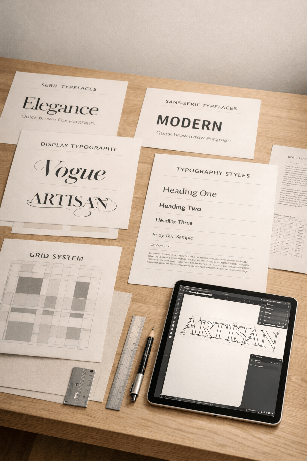
Serif Typefaces: Tradition, Authority, and Editorial Elegance
Serif typefaces are among the oldest and most established typographic styles. They are defined by the small finishing strokes called serifs that extend from the ends of letterforms.
These subtle details may seem minor, yet they significantly influence the tone of the typeface. Serifs create a sense of rhythm along lines of text, which historically made them particularly well suited for long-form reading in books, newspapers, and academic publications.
Because of this long association with publishing and scholarship, serif typefaces often convey qualities such as:
- heritage
- authority
- trustworthiness
- intellectual refinement
Many luxury brands, universities, and editorial publications rely on serif typography for precisely these reasons. Well-known examples include classic book faces like Times New Roman, Garamond, and Baskerville.
Within the serif category itself, several sub-styles exist:
- Old Style Serifs: Inspired by Renaissance calligraphy, these typefaces have a warm, humanist feel. Garamond is a well-known example.
- Transitional Serifs: More contrast between thick and thin strokes. Baskerville sits in this category.
- Modern Serifs (Didone): Highly refined with dramatic contrast and vertical stress. These are often used in luxury fashion and editorial design.
When choosing serif typography for a brand, it is helpful to consider the impression you want to create. A law firm or financial institution may benefit from the stability and credibility that serif typography conveys. A heritage brand might use it to reinforce history and craftsmanship.
Sans Serif Typefaces: Clarity, Modernity, and Digital Precision
If serif typefaces speak the language of tradition, sans serif typefaces communicate modern clarity. The term sans serif simply means “without serif.” These typefaces remove the finishing strokes from letters, resulting in clean, simplified forms. The aesthetic feels contemporary, minimal, and highly legible, which are qualities that have made sans serif typography especially prominent in digital design. Common examples include Helvetica, Futura, and Gill Sans.
Sans serif typefaces are often grouped into three main styles:
- Humanist Sans Serif: Inspired by handwriting and classical proportions. These feel warm and approachable.
- Geometric Sans Serif: Constructed from simple shapes such as circles and squares. These appear modern and precise.
- Neo-Grotesque Sans Serif: Highly neutral and balanced, making them versatile across many design systems.
Because of their clarity and scalability, sans serif fonts have become the dominant choice for web typography and user interface design. They perform well on screens, particularly at smaller sizes.
For brands positioning themselves as forward-thinking, innovative, or technology-driven, sans serif typography often reinforces that narrative effectively. However, the versatility of sans serif typography means it is not limited to technology companies. Many luxury brands combine a refined serif with a minimalist sans serif to achieve balance, pairing heritage with modernity.
When designers select a sans serif typeface for a brand, they consider how a font’s proportions, spacing, and overall tone support the brand strategy. Even within this seemingly simple category, subtle differences can dramatically influence how a brand feels.
Slab Serif Typefaces: Strength, Structure, and Distinctive Character
Slab serif typefaces are a bold and distinctive branch of the serif family. They are characterized by thick, block-like serifs that extend from the letterforms with little or no tapering. Where traditional serifs often feel delicate or refined, slab serifs appear confident, grounded, and visually robust.
Historically, slab serif typography became popular in the 19th century for advertising and posters, where designers needed typefaces that could command attention from a distance. Their strong shapes made them highly effective for headlines and signage. Examples include Rockwell and Clarendon.
Today, slab serifs are used in branding to convey qualities such as:
- strength
- reliability
- confidence
- craftsmanship
Because of their bold presence, slab serif fonts are often used selectively in headlines, logos, or display applications, rather than in long passages of body text.
For brands wanting to balance heritage with modern energy, slab serifs can be particularly effective, serving as memorable anchors within a cohesive visual system. They maintain the structural tradition of serif typography while introducing a more contemporary, confident edge.
However, successful use of slab serif typography requires careful balance. When used excessively, it can appear heavy or visually dominant. When paired thoughtfully with lighter typefaces, often a neutral sans serif, it creates a dynamic and highly legible typeface system.
Script Typefaces: Personality, Craft, and Human Expression
Script typefaces bring a very different voice to typography. Rather than geometric structure or editorial precision, they evoke the fluidity of handwriting and calligraphy. Script fonts are designed to mimic hand-drawn letterforms, often featuring flowing strokes, decorative flourishes, and connected characters. This naturally introduces a sense of personality and human warmth. Classic examples include Brush Script and Snell Roundhand, while more contemporary examples include La Luxes Script and New Icon Script.
Because of their expressive nature, script typefaces are rarely used for long passages of text. Instead, they are typically reserved for:
- taglines and limited headings
- packaging accents
- signature elements in brand identity
When used thoughtfully, script typography can evoke elegance, creativity, or artisanal craftsmanship. Luxury brands sometimes incorporate subtle script elements to add refinement or individuality. However, script typography requires careful restraint. Overuse can quickly reduce readability and diminish visual clarity.
Script typefaces often function best as accent typography, which serves as a complementary aesthetic rather than the primary focus of a typeface system. When integrated strategically alongside serif or sans serif fonts, script typography can introduce warmth and character while maintaining professional clarity.
Display Typefaces: Distinction and Visual Impact
Display typefaces exist primarily to capture attention. Unlike text fonts designed for readability across paragraphs, display fonts are created for large-scale applications such as headlines, posters, or brand marks. They often feature exaggerated proportions, unusual shapes, or highly stylized details. Contemporary examples include expressive designs like Cafela and Ghoip.
Because display fonts are visually striking, they play a powerful role in branding. A well-chosen display typeface can become a signature element of a brand’s visual identity.
However, this same boldness means they must be used carefully. Display fonts should support a brand’s personality without overwhelming its messaging.
For most brands, display typography works best when used sparingly, perhaps in:
- logo design
- limited headlines
When paired with a reliable subheading and body typefaces, display fonts can introduce visual hierarchy and memorability.
How to Choose the Right Typefaces for Your Brand
Understanding typeface categories is valuable, but the real goal is choosing typography that will appeal to your ideal audience and serves your brand strategically. A thoughtful typographic system considers several factors:
- Brand personality: Is your brand traditional, contemporary, luxurious, approachable, or innovative?
- Audience expectations: Typography should resonate with the people you are trying to reach.
- Medium and usage: Websites, printed materials, packaging, and presentations all impose different typographic requirements.
- Hierarchy and versatility: Most brands benefit from a small typographic system, often one primary typeface paired with two complementary secondary fonts.
Rather than selecting fonts based solely on visual preference, successful typography choices align with a broader brand strategy. Typography may appear subtle compared to colour or imagery, but its influence is profound.
Every headline, paragraph, and call to action communicates essential visual information, like tone, credibility, and personality. When typography aligns with your brand’s positioning, it quietly reinforces trust and recognition across every interaction.
By understanding the common categories of typeface, from serif and sans serif to script and display, you gain a clearer framework for making intentional design decisions. And ultimately, that intention is what transforms typography from a simple design element into a powerful expression of your brand.
Presenting Our Recent Work :
Return to the Archive Blog X


BORN & RAISED IN Calgary, Alberta AND IS
our ceo & lead designer WAS
proudly
Canadian
proudly Canadian.
Lauren Killam draws creative inspiration from both her academic background and global experiences. With a foundation in applied mathematics and anthropology, she brings a thoughtful blend of analytical precision and cultural curiosity to every project. Having lived in the Middle East and California before returning to Calgary, Lauren infuses her work with a rich mix of perspectives that are grounded in strategy, guided by empathy, and always ready to challenge the status quo.
Based in Calgary, Alberta and Proudly Canadian • Web Design • Graphic Design • Marketing Strategy • Visual Branding • Copy Writing • Product Development • Email Design • Social Media Design • SEO • Image Curation • Website Auditing • Based in Calgary, Alberta and Proudly Canadian • Web Design • Graphic Design • Marketing Strategy • Visual Branding • Copy Writing • Product Development • Email Design • Social Media Design • SEO • Image Curation • Website Auditing • Based in Calgary, Alberta and Proudly Canadian • Web Design • Graphic Design • Marketing Strategy • Visual Branding • Copy Writing • Product Development • Email Design • Social Media Design • SEO • Image Curation • Website Auditing • Based in Calgary, Alberta and Proudly Canadian • Web Design • Graphic Design • Marketing Strategy • Visual Branding • Copy Writing • Product Development • Email Design • Social Media Design • SEO • Image Curation • Website Auditing • Based in Calgary, Alberta and Proudly Canadian • Web Design • Graphic Design • Marketing Strategy • Visual Branding • Copy Writing • Product Development • Email Design • Social Media Design • SEO • Image Curation • Website Auditing •
Based in Calgary, Alberta and Proudly Canadian • Web Design • Graphic Design • Marketing Strategy • Visual Branding • Copy Writing • Product Development • Email Design • Social Media Design • SEO • Image Curation • Website Auditing • Based in Calgary, Alberta and Proudly Canadian • Web Design • Graphic Design • Marketing Strategy • Visual Branding • Copy Writing • Product Development • Email Design • Social Media Design • SEO • Image Curation • Website Auditing • Based in Calgary, Alberta and Proudly Canadian • Web Design • Graphic Design • Marketing Strategy • Visual Branding • Copy Writing • Product Development • Email Design • Social Media Design • SEO • Image Curation • Website Auditing •
 (1)")
")
Explore Our services
BrAND
IDENTITY
Refined branding that captures the heart of your business with clarity and elegance, leaving a lasting impression with every detail.
pause
")
Explore Our services
Graphic Design
Purposeful design that seamlessly blends style and function, crafting interactive experiences your audience will come to trust and depend on.
pause

Explore Our services
copy- writing
Carefully crafted copy that speaks with clarity and purpose, capturing your brand voice and compelling your audience to take action.
pause

Explore Our services
art direction
Curated art direction guides visual storytelling, upholding brand compliance and business objectives across multi-disciplinary teams.
pause

Explore Our services
Media curation
Thoughtfully curated media that aligns with your brand’s identity, bringing your message to life with authenticity and visual impact.
pause

Explore Our services
marketing strategy
Integrated, thoughtful strategy that bridges design and direction, shaping a clear path to attract and convert ideal clients with purpose and precision.
pause
")

Explore Our services
Search & AI
Optimization
Strategic search engine and AI optimization that amplifies your online presence, boosting visibility, driving traffic, and enhancing user experience.
pause
")
explore The Archive
explore
The Archive
Think of our blog as your insider pass to our private catalogue. You'll find expert insights and inspired guidance on everything from web design and copywriting to marketing strategy and creative inspiration. It’s all beautifully curated to help your business grow with style.
")
platform comparison

hot off the press
")
essential article
these are a few of
Our Things
Our
Things
favourite
QUICK DISCLOSURE
Many of the sections listed below contain affiliate links for products and services that our CEO has used and loved for years. This simply means that we may receive a commission if you purchase something from this page. It won't cost you more (in fact, a lot of these programs actually include special offers that save you money) and it really helps us out. Plus, ya know, we were going to share it with you anyway!
")
website builder
showit
the drag and drop
platform of dreams.
Showit is the RH of web design platforms. So, if you want a truly exquisite website without the six figure budget and months spent writing endless custom code, look no further.
SUBSCRIPTIONS START AT $22 USD/MONTH, BILLED YEARLY. You get A free month and so does Curator.

photography
sweet ginger
capture the Moments Your Heart will treasure.
It is our great pleasure to introduce you to Virginia. We are so deeply enamoured with her work, you can safely assume that any recent photograph of our CEO or family is a Sweet Ginger creation.
Investments vary by session type. you get a 15-minute mini session for $275 and WE get A $50 credit!
")
premium custom printing
Jukebox
the printer of dreams for Marketing Collateral
When you need materials to represent your brand in the analog world, trust Jukebox. Their proof system shows you exactly what your products will look like. #goodsurprisesonly
When you spend more than $50 on your order you get $25 off and we get a $25 credit.
 (1)")
Lead Magnets + More
BDOW!
the ultimate integrated conversion system
BDOW! gives you the best combination of features, flexibility, and pricing in the market. No coding required. Just everything you need to build high-converting experiences, connect your systems, and then launch, optimize, and grow.
send us an email to request discount info.
 (1)")
customer relationships
honeybook
Organize your business,
your way, all in one place.
HoneyBook is the software solution that has created the greatest freedom and ease in our business. We can focus on you because of its full suite of business management and client interaction tools.
SUBSCRIPTIONS START AT $16 USD/MONTH, BILLED YEARLY. You get 30% off your first year and we get up to $100.

Project management
Clickup
one (productivity) app
to replace them all.
What HoneyBook is to customer relationship management software, ClickUp is to project management software. We use ClickUp for lead magnet funnel strategies, and so much more.
Free plan available. I get $1.50 for free accounts and up to $20 per seat for paid accounts.
")
Digital workspace provider
Everything, everywhere, oraganized all at once.
Curator relies on Google Workspace to keep our business balanced with a productive and functional home life. Calendars, email, business and client files; this is how we manage our daily flow.
ask your project's lead designer for a unique promo code to get 10% off your first year.
")
information security
Keeper
Essential security for your everything.
We've been using Keeper to protect family passwords and streamline our home admin for YEARS. So, when I began my web design career, using Keeper for my business was the easiest choice ever.
Personal Plans begin at $2.92 USD/month. you get 30% Off and I get $30.
")
Financial management
quickbooks
the world's leader in business accounting
I can faithfully say that this is the most powerful accounting software I've used. While it's true that I appreciate QB's extensive features, its the numerous native integrations I treasure most.
subscriptions start at $24 CAD/month. You get 50% off your first 6 months and i get $100 CAD.
")
Business banking
Venn
stress-free and low-fee small business banking
We believe this is the most user-friendly and cost-effective business banking account available in Canada today. Sign up online, get instant cards, earn cashback, and don't get shocked by fees.
get an enrolment bonus of $100 when you spend more than $10,000 with your new venn card.
")
legal protection
WebsitePolicies
Website-Policies
simple cookie consent and privacy compliance
Cookie
& privacy compliance
The role of user activity data in a company's marketing activities is governed by complex legal frameworks. Compliance is essential, and websitepolicies makes it easy to stay on top of requirements.
The role of user activity data in a company's marketing activities is governed by complex legal frameworks. Compliance is essential, and Website-policies makes it easy to stay on track.
WebsitePolicies.com has the best pricing available. Choose the subscription that's right for you.
")
legal protection
contract shop
like your bff is a lawyer, but better.
like your bff is
a lawyer, but better.
It's no understatement to say that legal protection is an absolute necessity for every person or entity with an online presence. Website T&Cs, client contracts; you name it, you need it.
contract templates vary by type. You get peace of mind (priceless) and i get 20% on each sale.
The
BUSINESS


LOOKING for our INSTAGRAM?
Sorry, you're not going to find it.
Disappointed? Send us a quick note to strike up a conversation or request an in-person chat. We can't wait to meet you!
We respectfully acknowledge that our work takes place on the traditional and ancestral lands of the Treaty 7 region in Southern Alberta. This includes the Blackfoot Confederacy, comprising the Siksika, Piikani, and Kainai Nations, as well as the Tsuut’ina Nation and the Stoney Nakoda Nations of Chiniki, Bearspaw, and Goodstoney. We also recognize that Calgary is home to the Otipemisiwak Métis Government of the Métis Nation within Alberta, Region 3.
We honour the enduring relationships that Indigenous Peoples have with this land,
and we recognize that this territory has been a place of gathering, livelihood,
and cultural connection for over 10,000 years.
We acknowledge the deep and ongoing impacts of colonization, including displacement,
cultural erasure, systemic injustices, and intergenerational trauma that continue to affect
First Nations, Inuit, and Métis communities today. We recognize that
these harms are not only historical, but present and ongoing.
As a business, we are committed to listening, learning, and taking meaningful steps toward reconciliation. We strive to approach our work with respect, humility, and a responsibility to contribute, however we can, to a more equitable and inclusive future.
We honour the enduring relationships that Indigenous Peoples have with this land,
and we recognize that this territory has been a place of gathering, livelihood,
and cultural connection for over 10,000 years.
We acknowledge the deep and ongoing impacts of colonization, including displacement, cultural erasure, systemic injustices, and intergenerational trauma that continue to affect
First Nations, Inuit, and Métis communities today. We recognize that these harms are not only historical, but present and ongoing.
As a business, we are committed to listening, learning, and taking meaningful steps toward reconciliation. We strive to approach our work with respect, humility, and a responsibility to contribute, however we can, to a more equitable and inclusive future.
Home
Creative Services
Web Design
Brand Identity
Graphic Design
Copywriting
Art Direction
Media Curation
Strategy Services
Brand Strategy
Digital Strategy
About
The Archive Blog
Client Exhibitions
Join Curator
Questions & Answers
Contact Us
")
Showit vs. WordPress and 10 Reasons they Work Best Together
")
How to Create a Stand-Out Name for Your New Business
")