April 24, 2026
10 Signs You Need a New Website (And What to Do Next)
A website rarely becomes ineffective all at once.
More often, it continues to exist in a state that is technically functional, but increasingly out of step with the business it represents. The pages are still there. The information is still broadly accurate. But over time, the way the business presents itself begins to shift, and the website hasn’t kept up with that pace.
This shift can be difficult to notice when you are focused on growing or scaling your business. After all, your website is functional and you’re running a successful business.
And yet, over time, you start to notice that your website feels off.
You might notice it when you revisit your homepage and it no longer looks like a natural reflection of how you describe your work today. Or when you come across another website in your industry and sense a level of clarity or cohesion that your own website is lacking. In some cases, it appears more subtly, like in a brief moment of hesitation before you share your website with someone new.
It’s worth paying attention when this happens, because these signs are rarely isolated. They tend to point to a broader shift, reflecting how the business has developed while the website has remained much the same.
As expectations change, both your own and those of your audience, the role of the website becomes more apparent. It can support the business, or it can begin to hold it back because your website is a central component of both your brand and marketing strategies, and when it falls out of alignment in either of these two areas, the rest of your business begins to lose traction.
What follows are some of the most common ways this misalignment begins to appear, and how to recognize when it has reached a point where a new website is needed.
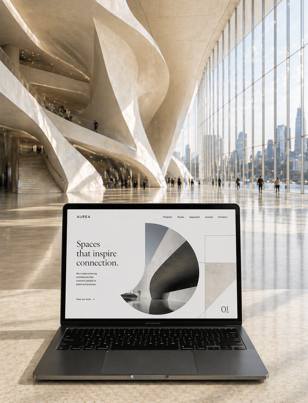
1. Your Website Looks Old or Outdated
There is often an immediate impression when a website feels like it belongs to a different time.
This is not usually the result of a single element, but a combination of small visual cues that, together, create a sense of something being slightly behind current expectations.
The navigation is often the first place this appears. A wide bar across the top of the page with numerous links, sometimes displaying different categories, or expanding into dropdown menus with multiple layers of options. Instead of guiding the visitor, it requires them to pause and decide where to go.
The layout itself can feel compressed or erratic. Sections are placed closely together, with limited spacing between them, or arranged in a way that does not create a clear flow from one idea to the next. It becomes more difficult to scan the page and understand what is most important.
Typography tends to reinforce this impression. Text may be smaller than expected, or inconsistent in style, with different fonts or sizes appearing across the page without a clear reason.
Images often carry a similar quality. They may feel dated, distorted, or simply not aligned with the overall tone of the business.
In contrast, more current websites tend to feel more intentional and creative. There is a clearer sense of hierarchy, more space between elements, and a more deliberate approach to what is included and what is left out.
The difference can be dramatic, and it is absolutely perceptible.
2. Your Branding Is Blurry, Too Small, or Inconsistent
Branding on a website should feel clear and consistent from the moment someone arrives.
When it does not, the issue often presents itself in subtle but noticeable ways. A logo may appear smaller than expected, positioned in the corner of the page without enough presence to be easily recognized. In some cases, it may contain fine details that do not translate well at smaller sizes, making it difficult to read clearly on screen.
(Hint: If you need a magnifying glass to see the details of your logo, it is too small.)
Colour is another common area where inconsistency appears. The tones used on the website may not match those used in other parts of the business. Certain sections may introduce slightly different shades, or use colour in a way that feels less intentional.
Typography can contribute to this as well. Different fonts or styles may appear across pages, or text may shift in size and spacing without a clear pattern. Over time, these changes can accumulate into something that feels disorganized.
None of these elements are necessarily problematic on their own. But taken together, they create a sense that the brand isn’t keeping pace with the market.
Well-presented brands feel stable and current. The brand identity is supported by a suite of logo variations that are clear, appropriately sized, and deployed in a manner that maximizes their impact. Colours are used consistently. Typography supports the content without drawing unnecessary attention.
When those elements begin to feel uneven, the overall impression becomes less certain, even if the visitor cannot immediately identify why.
3. Your Media Is Blurry or Outdated
Images often carry more weight on a website than text, particularly in the first moments when a new client lands on your home page. And when the quality of that imagery is subpar or inconsistent, it can affect how the entire site is perceived.
Images that are slightly pixelated when viewed at full size, or photographs that have been stretched to fit a layout they were not intended for make for a terrible first impression. In other cases, the issue is less technical and more stylistic, where the imagery reflects an earlier stage of the business and no longer aligns with how the work is presented today.
Low quality stock photography can also contribute to this feeling. Images that once felt appropriate may now appear generic or disconnected from the brand. They may not reflect the tone, level of detail, or type of work you are currently doing.
There can also be an inconsistency across the site. Some images feel more current, while others appear older or less considered. This creates a visual disconnect that is difficult to resolve without addressing the site as a whole.
A well-composed website tends to treat imagery as part of its structure. The quality is consistent, the style is intentional, and each image supports the content around it.
When that level of consistency is missing, it becomes noticeable, even if only in the background of the overall experience.
4. There’s Too Much Text
A website should make it easy to understand what you do without requiring sustained effort. When there is too much text, that clarity begins to diminish.
This often appears in long sections of uninterrupted copy, where multiple ideas are grouped together without clear separation. Paragraphs extend beyond what is comfortable to read on screen, and key points become harder to identify within the page.
Headings may not provide enough guidance, or may be used inconsistently, making it difficult to scan the content. Important information can become buried within larger blocks of text, requiring the reader to spend more time than they are likely willing to.
The issue is not necessarily that the content is incorrect or unnecessary. In many cases, it is a matter of structure.
Modern websites tend to approach this with more restraint. Content is broken into clearly defined sections. Spacing is used to create rhythm throughout a page. Headings and subheadings provide a clear path through the information.
Visitors rarely read a website in full. They move through it quickly, looking for relevance. When the content is not structured to support that behaviour, it introduces friction.
Over time, that friction affects how easily the site communicates what matters, and whether or not visitors become paying clients.
5. Your Offers Have Changed
It is quite common for a business to refine its services over time.
This may involve focusing on a smaller number of offers, adjusting how they are positioned, or shifting toward a different type of client. These changes often happen gradually, as you gain more clarity about what works and what feels aligned.
The website does not always reflect those changes immediately.
You may notice services still listed that you no longer provide, or descriptions that do not fully match how you now speak about your work. In some cases, newer offers may be present but not clearly defined, sitting alongside older ones without a clear distinction.
This creates a significant disconnect that can feel jarring and disorienting.
A visitor encountering your website is trying to understand what you do and whether it is relevant to them. If the information does not reflect the current state of the business, that process will be interrupted or unsuccessful.
Even when the differences are small, they can affect how clearly the offering is perceived.
A website that reflects the current structure of the business allows for a more straightforward connection. When it does not, the visitor is left to interpret which parts are still accurate and which are no longer applicable. In most cases, visitors in this situation will just leave rather than spend their valuable time and energy interpreting your website.
6. Your Website Doesn’t Reflect Your Brand Identity
As a business develops, its identity tends to become more defined, even if that process is not formally articulated.
You begin to recognize what feels aligned and what does not. Certain visual choices become more consistent. The tone you use when speaking about your work becomes clearer. Over time, these decisions shape a more cohesive sense of the brand.
These changes are often most visible in the parts of the business you update regularly. Your social media may feel more current. Your proposals may reflect a more refined point of view. Even your portfolio, if it is actively maintained, may show a clearer direction in the type of work you are presenting.
The website, however, often remains unchanged.
When you return to it, the difference often becomes more noticeable the longer you look. The colours may not feel quite right compared to how you use them elsewhere. Typography may appear less considered. Imagery may no longer align with the tone you have developed in other areas.
The language can reflect this as well. It may still describe your work accurately, but not in a way that feels as precise or as natural as it does in conversation.
Individually, these differences are subtle. Together, they create a sense that the website belongs to an earlier version of the business, while everything around it has moved forward.
This lack of alignment can affect how cohesive the overall brand feels, even if it is not something a visitor would immediately identify.
7. Your Content Doesn’t Support Your Business
A website is not only a place where your services are described. It is a central part of how your business communicates over time.
In many cases, it forms the foundation of your content marketing. It is where potential clients come to understand not just what you offer, but how you think, how you work, and whether you are someone they feel confident exchanging value with.
When the content on a website does not support that process, the gap can be significant.
This often begins with the core pages. Service descriptions may outline what you do, but not in a way that demonstrates depth of expertise. The language may feel general, or focused on listing features rather than explaining your approach or perspective. As a result, a visitor may leave with a basic understanding, but without a clear sense of what distinguishes your work.
Blog content, if it exists, can reflect a similar pattern. Articles may be infrequent, or written around topics that are only loosely connected to your current focus. In some cases, they may not address the questions your clients are actively asking, or provide the level of insight that would help establish authority.
Taken together, this means the website is not doing one of its most important roles: it is not helping people move from awareness to confidence.
A website build on solid brand and digital marketing strategies allows someone to spend time with your business before ever speaking to you. Through the content, they begin to understand your thinking, recognize your expertise, and develop a sense of trust. They start to see how you approach your work, and whether that approach aligns with what they are looking for.
When that layer is missing, the website may informative, but not persuasive.
And in practice, this often means that more of the work of building trust shifts into conversations, rather than being supported by the site itself.
8. Your Website Is Not Mobile Friendly
Most websites are now encountered on a phone first, often in a setting where attention is limited.
In that context, the experience of the site becomes particularly important.
A website that feels acceptable on a desktop can feel noticeably different on a smaller screen. Text may appear slightly smaller than is comfortable to read at a glance. Buttons may be positioned close together, requiring more precision than expected. Sections may extend further than they need to, making it difficult to move through the page efficiently.
Navigation is often where this becomes more apparent. A menu that functions well across a wide layout may feel layered or less intuitive when condensed. It may take an extra moment to locate a page that should be immediately accessible.
Images can also shift in subtle ways. They may crop differently or lose clarity, which can affect how considered the overall presentation feels.
None of these issues are necessarily severe on their own. But together, they create an experience that requires more attention than it should.
A website that has been carefully considered for mobile tends to feel easier to move through. The structure is simplified, and the most important information is readily accessible.
When that ease is missing, even slightly, it can influence how the site is experienced as a whole.
9. Your Competitors Have Better Websites
Comparison is often where these differences become more apparent.
You may come across another website in your industry and notice that it feels easier to navigate. The structure is clearer. The messaging is more direct. The overall presentation feels more aligned with current expectations.
This does not necessarily mean the business itself is stronger. But the way it is presented makes it easier to understand and more attractive to your ideal clients.
You may notice that their navigation is simpler, with fewer options. The layout has more space, making it easier to scan. Key points are easier to identify, and the path through the site feels more deliberate. Imagery may feel more cohesive. The tone of the writing may feel more consistent. Overall, the experience requires less effort.
Returning to your own website after that, the contrast can become more noticeable.
This is not about following trends or replicating what others are doing. It is about recognizing the standard your audience is experiencing elsewhere.
Visitors do not view websites in isolation. They move between them, often within a short period of time, as they are assessing which service or products to engage with.
When another site feels clearer or more considered, it shapes how your own is perceived by comparison.
10. You Feel Embarrassed to Share Your Website with Potential Clients
This is often the most direct and reliable indicator of whether you need a new website.
It tends to appear in small moments. You are about to send your website to a potential client, and you hesitate. Instead, you consider directing them elsewhere. You might share your social media, where your work feels more current, or suggest a conversation so you can explain things more clearly.
Over time, these decisions can become habitual.
You may find yourself relying more on email or calls to communicate what you do. You might choose to send specific pages rather than your home page, or add additional context to ensure nothing is misunderstood.
In some cases, you may attempt to update the site yourself in a flurry before sharing it. Adjusting text, replacing images, or reorganizing sections in an effort to bring it closer to where the business is now.
These changes can improve certain areas, but without a broader structure to support them, the result can feel disorganized. New elements sit alongside older ones, and the overall experience becomes less cohesive.
Eventually, the effort to adjust it may stop, and the workarounds continue.
That hesitation is usually a clear signal.
It suggests that the website no longer represents the business with the level of clarity or confidence you would expect, and that the issue is not confined to a single section, but present across the site as a whole.
So… Do You Need a New Website? & What To Do Next
It is rarely one issue in isolation that determines whether a new website is needed. More often, it is the accumulation of small misalignments that, taken together, begin to affect how a business is presented and understood.
A simple way to assess this is to consider how many of the points above feel familiar, and to use that as a guide for what to do next.
If you identified with even one, it is usually an indication that the website has begun to fall slightly out of step. The gap may not be urgent, but it is present. At this stage, the next step is to begin planning. This often means setting aside time to review your current site more critically, identifying where it no longer reflects your business, and starting to budget for a new, professionally built website within the next year.
If several of the signs applied, the situation tends to be more pressing.
When multiple areas of the site feel misaligned, whether in structure, content, or presentation, it becomes increasingly difficult for the website to support the business effectively. At this point, the next step is to move from planning into action. This may involve speaking with a web design partner, clarifying your goals, and beginning the process of outlining what a new site needs to do differently. In most cases, this is where a six-month timeline becomes more appropriate.
And if five or more of these signs felt recognizable, it is usually an indication that a new website is urgently needed.
When a site no longer reflects the quality of your work, does not clearly communicate your offers, and requires you to compensate in other areas, it begins to have a tangible impact. Potential clients may find it harder to understand what you do. Trust takes longer to establish. Opportunities can be lost in ways that are not always immediately visible. At this stage, the next step is to prioritise a full website redesign as a near-term project, rather than something to revisit later.
In that context, a new website is not simply an upgrade. It is a necessary step in bringing the business back into alignment with how it has developed.
This is where a more considered approach becomes important.
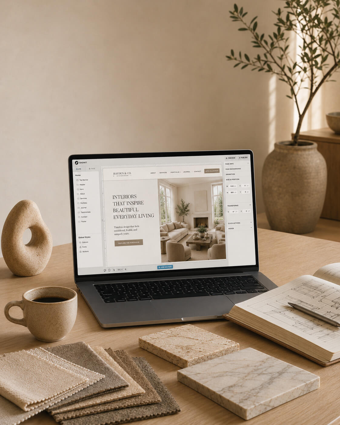
At Curator, the focus is on understanding how your business has evolved and how it needs to be represented now. That process brings together structure, messaging, and design, so that each element supports the others rather than working in isolation.
The aim is to create a website that feels clear, cohesive, and easy to move through. One that demonstrates your expertise, reflects your brand accurately, and supports your wider marketing rather than sitting slightly apart from it.
When that alignment is in place, your website becomes something you can share without hesitation, knowing that it represents your business accurately and is built on a well-defined strategy to support its long-term value.
Categories
Presenting Our Recent Work :
Return to the Archive Blog X


BORN & RAISED IN Calgary, Alberta AND IS
our ceo & lead designer WAS
proudly
Canadian
proudly Canadian.
Lauren Killam draws creative inspiration from both her academic background and global experiences. With a foundation in applied mathematics and anthropology, she brings a thoughtful blend of analytical precision and cultural curiosity to every project. Having lived in the Middle East and California before returning to Calgary, Lauren infuses her work with a rich mix of perspectives that are grounded in strategy, guided by empathy, and always ready to challenge the status quo.
Based in Calgary, Alberta and Proudly Canadian • Web Design • Graphic Design • Marketing Strategy • Visual Branding • Copy Writing • Product Development • Email Design • Social Media Design • SEO • Image Curation • Website Auditing • Based in Calgary, Alberta and Proudly Canadian • Web Design • Graphic Design • Marketing Strategy • Visual Branding • Copy Writing • Product Development • Email Design • Social Media Design • SEO • Image Curation • Website Auditing • Based in Calgary, Alberta and Proudly Canadian • Web Design • Graphic Design • Marketing Strategy • Visual Branding • Copy Writing • Product Development • Email Design • Social Media Design • SEO • Image Curation • Website Auditing • Based in Calgary, Alberta and Proudly Canadian • Web Design • Graphic Design • Marketing Strategy • Visual Branding • Copy Writing • Product Development • Email Design • Social Media Design • SEO • Image Curation • Website Auditing • Based in Calgary, Alberta and Proudly Canadian • Web Design • Graphic Design • Marketing Strategy • Visual Branding • Copy Writing • Product Development • Email Design • Social Media Design • SEO • Image Curation • Website Auditing •
Based in Calgary, Alberta and Proudly Canadian • Web Design • Graphic Design • Marketing Strategy • Visual Branding • Copy Writing • Product Development • Email Design • Social Media Design • SEO • Image Curation • Website Auditing • Based in Calgary, Alberta and Proudly Canadian • Web Design • Graphic Design • Marketing Strategy • Visual Branding • Copy Writing • Product Development • Email Design • Social Media Design • SEO • Image Curation • Website Auditing • Based in Calgary, Alberta and Proudly Canadian • Web Design • Graphic Design • Marketing Strategy • Visual Branding • Copy Writing • Product Development • Email Design • Social Media Design • SEO • Image Curation • Website Auditing •
 (1)")
")
Explore Our services
BrAND
IDENTITY
Refined branding that captures the heart of your business with clarity and elegance, leaving a lasting impression with every detail.
pause
")
Explore Our services
Graphic Design
Purposeful design that seamlessly blends style and function, crafting interactive experiences your audience will come to trust and depend on.
pause

Explore Our services
copy- writing
Carefully crafted copy that speaks with clarity and purpose, capturing your brand voice and compelling your audience to take action.
pause

Explore Our services
art direction
Curated art direction guides visual storytelling, upholding brand compliance and business objectives across multi-disciplinary teams.
pause

Explore Our services
Media curation
Thoughtfully curated media that aligns with your brand’s identity, bringing your message to life with authenticity and visual impact.
pause

Explore Our services
marketing strategy
Integrated, thoughtful strategy that bridges design and direction, shaping a clear path to attract and convert ideal clients with purpose and precision.
pause
")

Explore Our services
Search & AI
Optimization
Strategic search engine and AI optimization that amplifies your online presence, boosting visibility, driving traffic, and enhancing user experience.
pause
")
explore The Archive
explore
The Archive
Think of our blog as your insider pass to our private catalogue. You'll find expert insights and inspired guidance on everything from web design and copywriting to marketing strategy and creative inspiration. It’s all beautifully curated to help your business grow with style.
")
platform comparison

hot off the press
")
essential article
these are a few of
Our Things
Our
Things
favourite
QUICK DISCLOSURE
Many of the sections listed below contain affiliate links for products and services that our CEO has used and loved for years. This simply means that we may receive a commission if you purchase something from this page. It won't cost you more (in fact, a lot of these programs actually include special offers that save you money) and it really helps us out. Plus, ya know, we were going to share it with you anyway!
")
website builder
showit
the drag and drop
platform of dreams.
Showit is the RH of web design platforms. So, if you want a truly exquisite website without the six figure budget and months spent writing endless custom code, look no further.
SUBSCRIPTIONS START AT $22 USD/MONTH, BILLED YEARLY. You get A free month and so does Curator.

photography
sweet ginger
capture the Moments Your Heart will treasure.
It is our great pleasure to introduce you to Virginia. We are so deeply enamoured with her work, you can safely assume that any recent photograph of our CEO or family is a Sweet Ginger creation.
Investments vary by session type. you get a 15-minute mini session for $275 and WE get A $50 credit!
")
premium custom printing
Jukebox
the printer of dreams for Marketing Collateral
When you need materials to represent your brand in the analog world, trust Jukebox. Their proof system shows you exactly what your products will look like. #goodsurprisesonly
When you spend more than $50 on your order you get $25 off and we get a $25 credit.
 (1)")
Lead Magnets + More
BDOW!
the ultimate integrated conversion system
BDOW! gives you the best combination of features, flexibility, and pricing in the market. No coding required. Just everything you need to build high-converting experiences, connect your systems, and then launch, optimize, and grow.
send us an email to request discount info.
 (1)")
customer relationships
honeybook
Organize your business,
your way, all in one place.
HoneyBook is the software solution that has created the greatest freedom and ease in our business. We can focus on you because of its full suite of business management and client interaction tools.
SUBSCRIPTIONS START AT $16 USD/MONTH, BILLED YEARLY. You get 30% off your first year and we get up to $100.

Project management
Clickup
one (productivity) app
to replace them all.
What HoneyBook is to customer relationship management software, ClickUp is to project management software. We use ClickUp for lead magnet funnel strategies, and so much more.
Free plan available. I get $1.50 for free accounts and up to $20 per seat for paid accounts.
")
Digital workspace provider
Everything, everywhere, oraganized all at once.
Curator relies on Google Workspace to keep our business balanced with a productive and functional home life. Calendars, email, business and client files; this is how we manage our daily flow.
ask your project's lead designer for a unique promo code to get 10% off your first year.
")
information security
Keeper
Essential security for your everything.
We've been using Keeper to protect family passwords and streamline our home admin for YEARS. So, when I began my web design career, using Keeper for my business was the easiest choice ever.
Personal Plans begin at $2.92 USD/month. you get 30% Off and I get $30.
")
Financial management
quickbooks
the world's leader in business accounting
I can faithfully say that this is the most powerful accounting software I've used. While it's true that I appreciate QB's extensive features, its the numerous native integrations I treasure most.
subscriptions start at $24 CAD/month. You get 50% off your first 6 months and i get $100 CAD.
")
Business banking
Venn
stress-free and low-fee small business banking
We believe this is the most user-friendly and cost-effective business banking account available in Canada today. Sign up online, get instant cards, earn cashback, and don't get shocked by fees.
get an enrolment bonus of $100 when you spend more than $10,000 with your new venn card.
")
legal protection
WebsitePolicies
Website-Policies
simple cookie consent and privacy compliance
Cookie
& privacy compliance
The role of user activity data in a company's marketing activities is governed by complex legal frameworks. Compliance is essential, and websitepolicies makes it easy to stay on top of requirements.
The role of user activity data in a company's marketing activities is governed by complex legal frameworks. Compliance is essential, and Website-policies makes it easy to stay on track.
WebsitePolicies.com has the best pricing available. Choose the subscription that's right for you.
")
legal protection
contract shop
like your bff is a lawyer, but better.
like your bff is
a lawyer, but better.
It's no understatement to say that legal protection is an absolute necessity for every person or entity with an online presence. Website T&Cs, client contracts; you name it, you need it.
contract templates vary by type. You get peace of mind (priceless) and i get 20% on each sale.
The
BUSINESS


LOOKING for our INSTAGRAM?
Sorry, you're not going to find it.
Disappointed? Send us a quick note to strike up a conversation or request an in-person chat. We can't wait to meet you!
We respectfully acknowledge that our work takes place on the traditional and ancestral lands of the Treaty 7 region in Southern Alberta. This includes the Blackfoot Confederacy, comprising the Siksika, Piikani, and Kainai Nations, as well as the Tsuut’ina Nation and the Stoney Nakoda Nations of Chiniki, Bearspaw, and Goodstoney. We also recognize that Calgary is home to the Otipemisiwak Métis Government of the Métis Nation within Alberta, Region 3.
We honour the enduring relationships that Indigenous Peoples have with this land,
and we recognize that this territory has been a place of gathering, livelihood,
and cultural connection for over 10,000 years.
We acknowledge the deep and ongoing impacts of colonization, including displacement,
cultural erasure, systemic injustices, and intergenerational trauma that continue to affect
First Nations, Inuit, and Métis communities today. We recognize that
these harms are not only historical, but present and ongoing.
As a business, we are committed to listening, learning, and taking meaningful steps toward reconciliation. We strive to approach our work with respect, humility, and a responsibility to contribute, however we can, to a more equitable and inclusive future.
We honour the enduring relationships that Indigenous Peoples have with this land,
and we recognize that this territory has been a place of gathering, livelihood,
and cultural connection for over 10,000 years.
We acknowledge the deep and ongoing impacts of colonization, including displacement, cultural erasure, systemic injustices, and intergenerational trauma that continue to affect
First Nations, Inuit, and Métis communities today. We recognize that these harms are not only historical, but present and ongoing.
As a business, we are committed to listening, learning, and taking meaningful steps toward reconciliation. We strive to approach our work with respect, humility, and a responsibility to contribute, however we can, to a more equitable and inclusive future.
Home
Creative Services
Web Design
Brand Identity
Graphic Design
Copywriting
Art Direction
Media Curation
Strategy Services
Brand Strategy
Digital Strategy
About
The Archive Blog
Client Exhibitions
Join Curator
Questions & Answers
Contact Us
")
Showit vs. WordPress and 10 Reasons they Work Best Together
")
How to Create a Stand-Out Name for Your New Business
")